How to handle elevation for your design system
What is elevation and why it matters:
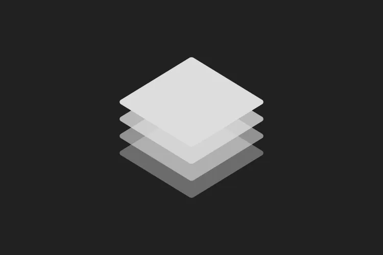
Giving UI a sense of depth makes it feel more grounded, closer to how we perceive the real world. Like color and spacing, elevation helps categorize elements and establish hierarchy: it tells users what’s on top, what’s in the background, and what’s interactive.
To express this depth visually, the approach changes depending on the theme. In light mode, shadows do the heavy lifting, they simulate a light source casting shade beneath raised surfaces. In dark mode, shadows lose their effectiveness against dark backgrounds, so elevation is expressed through surface brightness instead: the deeper the layer, the darker the surface; the higher it sits, the lighter it gets.
Choosing how many elevation levels:
The first step is deciding how many elevation levels you actually need. Most guidelines recommend 4 to 5, but in my experience 3 are enough. I worked on two fairly large products involving dashboards and a wide range of UI components, and never felt the need for more.
That said, nothing is set in stone, you can always add or remove levels over time. What matters is starting with a clear intention: each level should map to specific use cases and components. When the rules are defined upfront, designers stay consistent without having to think about it every time.
The best way to enforce this is to bake elevation directly into your components in Figma and in code. If a card already has the correct surface color and shadow built in, neither designers nor developers need to make that decision manually the right pattern is simply the default.
What are the three levels and when to use them
The levels I use are the following:
Base: the background, the foundation everything sits on.
Level 1: cards, side navigation, floating action buttons, modals and drawers placed on an overlay.
Level 2: elements that sit on top of the previous two: tooltips, dropdown menus, toast messages, and so on.
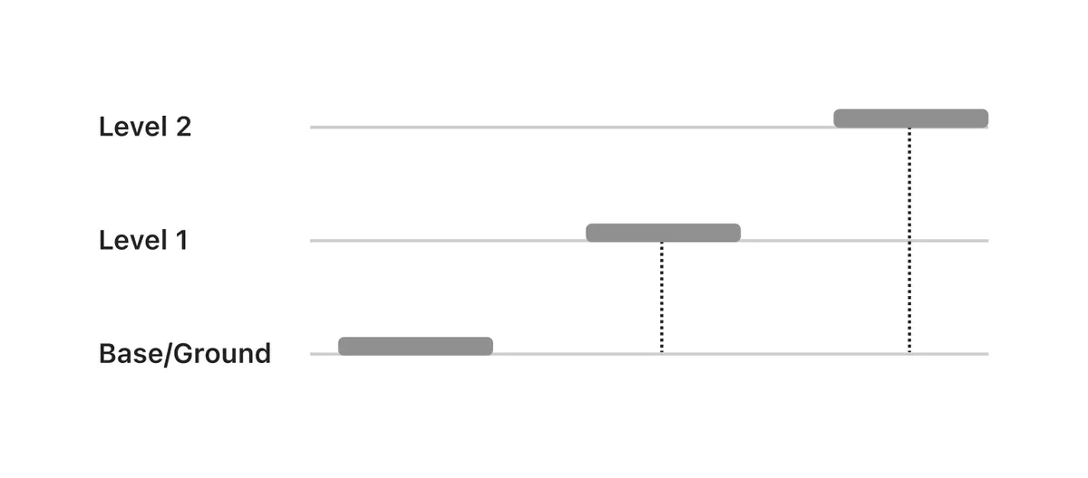
Many guides recommend at least 4 levels, reserving the fourth for modals with an overlay. In my experience this is unnecessary, and if you think about it the reason is pretty intuitive.
A modal with an overlay is not really a new layer on top of everything else. It is more like placing a transparent sheet over your whole UI, pressing everything down, and starting fresh. The overlay becomes the new background, and the modal card sits right back at Level 1. No new level needed. The same logic works the other way too: if you treat modals as a fourth elevation level, where does a dropdown inside that modal go? Level 5? Elevation makes sense when it describes the context an element lives in, not its absolute position in some global stack.
How to build elevation on a light theme
In a light theme, background colors and drop shadows work together to create the sense of layering. I define three background tokens: background-base as the page base, background-raised for cards and navigation, and background-floating for dropdowns and tooltips. All three are defined as Figma variables and baked into components directly, so designers do not need to make that choice every time.
To pick the background colors, I work in HSB mode directly in Figma’s color panel. Keep the hue and saturation fixed, and step the brightness down by 1 to 2 points between each level. So if your base background is at 100, raised sits at 98 or 97, and floating at 96 or 94. Small steps, but enough to create a visible and consistent separation.
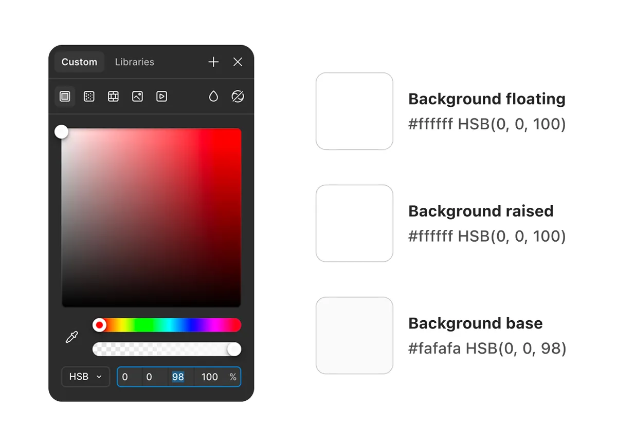
In light mode specifically, background-raised and background-floating can share the same value, in my case both are #ffffff. What differentiates them is not the color but the drop shadow: a less elevated one for raised elements like cards, and a more elevated one for floating elements like dropdowns and tooltips. This is also why naming them by role rather than by color value matters: in dark mode the two tokens will resolve to different values, and the distinction becomes visual rather than just semantic.
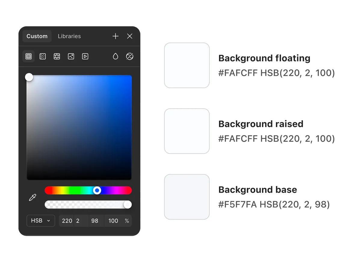
If you decide to add a brand tint to your backgrounds, stay in HSB, set your brand hue, keep the saturation between 1 and 2 for all three levels and then apply the same brightness steps as we have done before for neutral colors. The saturation value stays low enough to not be too invasive but still gives the surfaces a subtle branded feel.
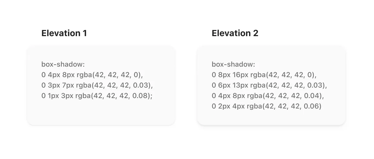
For shadows, smooth shadows are the way to go. A smooth shadow is made of multiple shadow layers stacked together, which mimics how shadows behave in the real world and makes them feel less synthetic than a single flat one. The easiest way to build them in Figma is with the Smooth Shadow plugin, also recommended by Mattia Astorino when I worked at Wonderflow. You will need two: a less elevated one for background-raised elements like cards, and a more elevated one for background-floating elements like dropdowns and tooltips.
How to build elevation on a dark theme
In a dark theme, shadows become nearly invisible against dark surfaces, so elevation is expressed through brightness instead. The lighter a surface, the closer it feels to the light source and the higher it sits: background-base is the darkest, background-raised is a step lighter, and background-floating is the lightest of the three. Unlike in light mode, all three tokens will have distinct values.

To build them, work in HSB and increase the brightness by 2 to 3 points between each level, keeping hue and saturation fixed. So if your base starts at 10, raised sits at 12 or 13, and floating at 14 or 16.
If you want to add a brand tint, the same logic as light mode applies: set your brand hue and keep saturation between 15 and 20 across all three levels, then apply the brightness steps as above. On dark surfaces colors absorb more light, so you need a higher saturation value than in light mode to get a visible tint.
One last thing worth noting: the background tokens should not live outside your color system. Whatever brightness steps you choose for base, raised and floating should map to stops that already exist in your neutral palette. If your palette goes from 0 to 100 in steps of 5, your surface colors should land on those steps, not between them. This keeps your token system consistent and avoids having one-off values that are impossible to maintain or hand off cleanly.
A sidenote on border in elevation
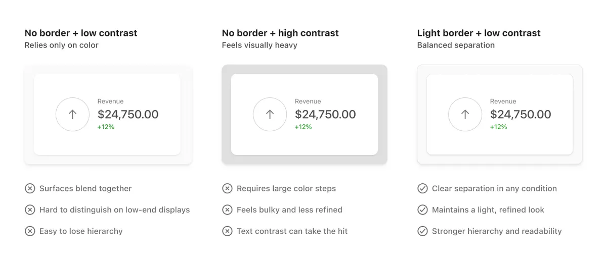
Personally, I also think adding a subtle border to surfaces is good practice to make components more accessible overall. Material Design 3 for example does not add them by default to non-interactive elements, which is technically fine from an accessibility standpoint. But relying only on color and shadows puts you in a difficult position: step the colors too close together and they look identical on low-end displays, step them too far apart and the interface starts feeling visually heavy, with text contrast potentially taking the hit. A subtle border on cards and panels gives you a reliable third signal that works across display qualities, without needing to push your color steps to the extreme.