
How to build icon systems in Figma: tokens, naming, and delivery

Benefits of building an icon system for your design system foundation:
Having a proper icon system is one of the fundamentals of a design system foundation. It gives consistency to the product and makes life easier for both designers and developers.
Without it, designers end up copying icons from random files, losing time and introducing inconsistencies, different sizes, similar icons with slightly different styles, duplicates. Small things that, when added up, make a product feel unpolished.
A well-built icon system gives everyone a single place to find the right icon for the right use case. It also makes the developer side cleaner: icons can be exported in a structured way and any new addition goes through a process, so nothing ends up in the product without being part of the foundation first.
Choosing the right icon library:
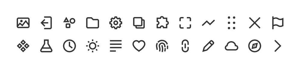
The first step is deciding whether to build a custom icon library or use an existing one, free or paid. Honestly, in 99% of cases it makes more sense to go with something that already exists. Building one from scratch is time consuming and basically requires a dedicated person. It only really makes sense for companies with a big budget and a mature product, where most icons are already well defined and a custom set becomes a quality upgrade rather than a foundation task.
A custom library gives you more brand control, sure. But users don’t really notice or care about which icon library you picked. What they do notice is when icons feel inconsistent, are hard to read, or don’t match the context they’re used in.
What actually matters is that the style is cohesive, the sizing is correct and every icon is clear and appropriate for its use case.
For the reasons above, I’d recommend choosing an icon set with a lot of icons. The more coverage it has, the less likely you’ll need to draw something from scratch. It’s tempting to buy a small pack on UI8 or similar marketplaces, but keep in mind that every missing icon is one you’ll have to design yourself, staying consistent with the existing style, and as we’ll see later, probably at multiple sizes. That adds up fast.
My recommendation is to start from one of the big open source sets: Font Awesome (free, with an optional Pro tier), Material Symbols, Phosphor, Lucide or Tabler. For Marianne, the design system I’m building for this series, I went with Nucleo. It is a paid set with a one-time fee of $149 for lifetime access, not sponsored, I just find it worth it. Mattia Astorino introduced it to me while we were both working at Wonderflow, where he was managing the entire design system. I’ve been using it in my own projects ever since.
Before importing your icons decide: styles, sizes and stroke widths
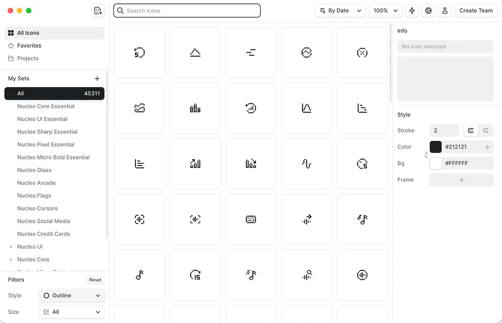
The first step is creating a dedicated page inside the foundation file. I usually call it “Iconography” and keep it in a separate Figma file dedicated to the foundation. I might write a future article on why I prefer to keep them separated, but you can also keep it on the same page as your components. You also need to decide how many icon styles to support: outlined, filled, duotone…
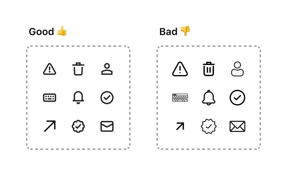
I personally keep outlined and filled, using outlined as the default and filled for specific cases like selected states in chips or tags, where switching to filled adds a visual cue without relying on color alone. Whatever you choose, the important thing is to define clear rules on when and how each style gets used. Mixing them without a reason creates inconsistency, makes the product feel less polished, and adds cognitive load for the user who might start associating different styles with different functionalities when there are none.
For Marianne I went with two sizes: 16px and 24px. I chose these sizes based on the use cases I knew I’d need to cover later in the design system, like buttons, icon buttons and badges. Both sizes also fit neatly into the 4px grid I use across the products I build, which makes alignment consistent without any extra work. I find 16 and 24 a good compromise, 16 for regular and small elements and 24 for larger ones. If a specific use case needs something bigger I just scale up from there rather than building a third set.
Speaking from experience, in a previous project the icons were designed at 16px but then scaled down to 14px in the final product. In retrospect it had two problems: scaling them down meant losing the icon grid settings entirely and more importantly smaller icons lose immediacy. An icon that is hard to see is hard to understand, which defeats the whole purpose. I would say 16px should be the minimum.
Building the icon grids in Figma to import your icons
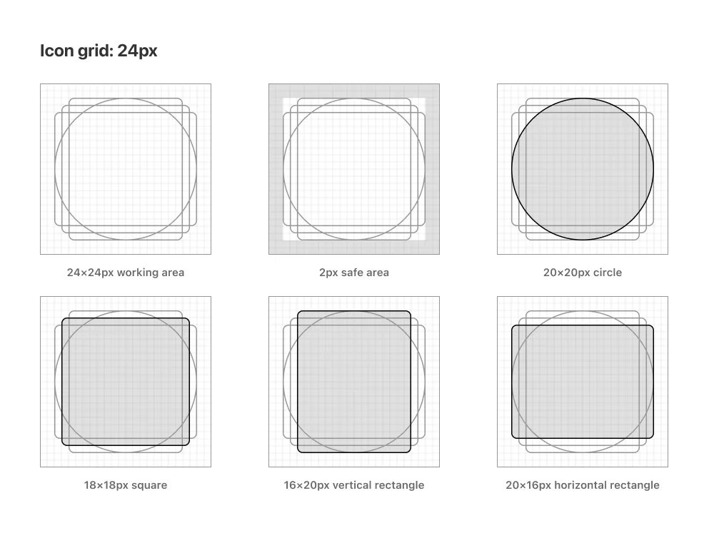
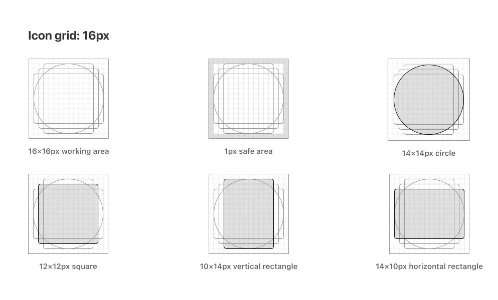
To build the two icon grids, add two frames in Figma, one at 24×24px and one at 16×16px. Add a small stroke to visualize the working area boundary, then define a safe area inside: 2px for the 24px grid, 1px for the 16px one. This safe area keeps the icon from touching the edges and ensures consistent optical spacing across the set.
Once the frame is ready, place the key shapes inside. These are the reference shapes you’ll use to align each icon depending on its form. For the 24px grid: a 20×20px circle, an 18×18px square, a 16×20px vertical rectangle, and a 20×16px horizontal rectangle. For the 16px grid: a 14×14px circle, a 12×12px square, a 10×14px vertical rectangle and a 14×10px horizontal rectangle. The grids are shown below for reference.
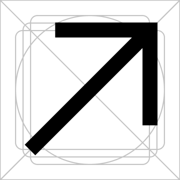
Once the grids are ready, it is time to start placing the icons. First set the stroke width, then drop the icon into the frame and scale it to fit the key shape that matches its form best: circular icons align to the circle, square icons to the square, tall or wide icons to the respective rectangle.
An optional but worthwhile step is to nudge the anchor points of each icon to align with the pixel grid where possible. This reduces antialiasing, which is most noticeable on older or budget monitors with a DPR of 1. On modern devices with higher pixel density it becomes hard to spot, but it is still good practice to check when you can.
This is also why I recommend sticking to whole or 0.5 values for stroke widths and icon sizes. On DPR 2 screens, 0.5px elements render cleanly on a physical pixel. On higher density screens the difference becomes almost invisible either way.
Naming:
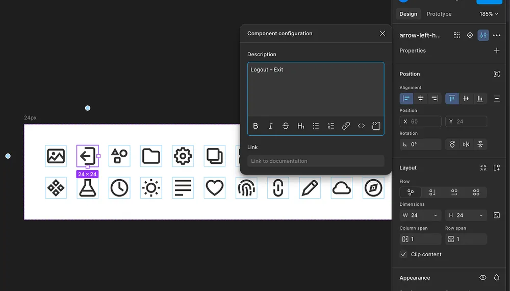
The naming convention I use follows this structure: descriptive-icon-name_style_size. For example: chevron-right_outlined_24px.
Why this structure? The icon name comes first so when you search for it in Figma it shows up at the top of the list. The style comes second so you can filter between filled and outlined variants. The size at the end works as a quick sanity check, especially useful when an icon gets scaled in a specific context and you want to confirm you are using the right one.
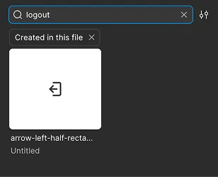
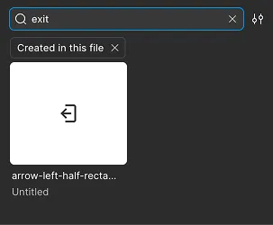
Why descriptive names instead of functional ones? A descriptive name tells you what the icon looks like, a functional name tells you what it does. The problem with functional names is that the same icon can mean different things in different contexts. An arrow pointing right could be “go to next page”, “proceed to checkout”, or “expand panel” depending on where it lives. Naming it arrow-right keeps it neutral and reusable. The context lives in the component that uses it, not in the icon itself.
But how do designers find the right icon if the name is purely descriptive? In Figma you can add aliases to any component by opening the component settings panel and adding keywords in the description field. Those aliases are searchable, so a designer looking for “next” or “forward” will still find arrow-right without you having to change the name.
When an icon is a combination of two objects, the primary object comes first and the modifier second. So a bell with a plus becomes bell-plus and an arrow inside a square becomes arrow-right-square. If there is no clear hierarchy between the two, use the foreground object first.
What if an icon only comes in one style? Skip the style part of the convention. If arrows in your set are always outlined there is no point adding it to the name. I keep them as arrow-right_24px and it works fine. If you prefer to keep it consistent across all icons you can still add it, but in my experience the shorter version causes no issues.
How icons go from Figma to production
In a previous project, the delivery side was handled together with the development teams across web, iOS and Android. We aligned on a shared structure and a script that, once run, would pull the new icons and make them available for development. As a designer I was not directly involved in the technical setup, but the result was a clean handoff process: once a new icon was added to the library, developers would run the script and have it ready to use.
Governance: how new icons get added
In general, a design system works best when it’s managed by one or two dedicated people. Having a clear point of reference makes it easier to keep consistency and communicate changes across teams. When everyone can edit the system freely, inconsistencies pile up fast, updates get lost, and not every designer enjoys or has the mindset for design system work.
The flow we used to add new icons was pretty straightforward. A designer would message me or Cristian (an ex colleague) on Slack with the icon they needed, the context it would be used in and the name of the icon in the library. In most cases it made sense, so it got added to the library. The designer was then notified it was available, and developers were informed so they could pull the new asset when needed for the feature or refactor they were working on.
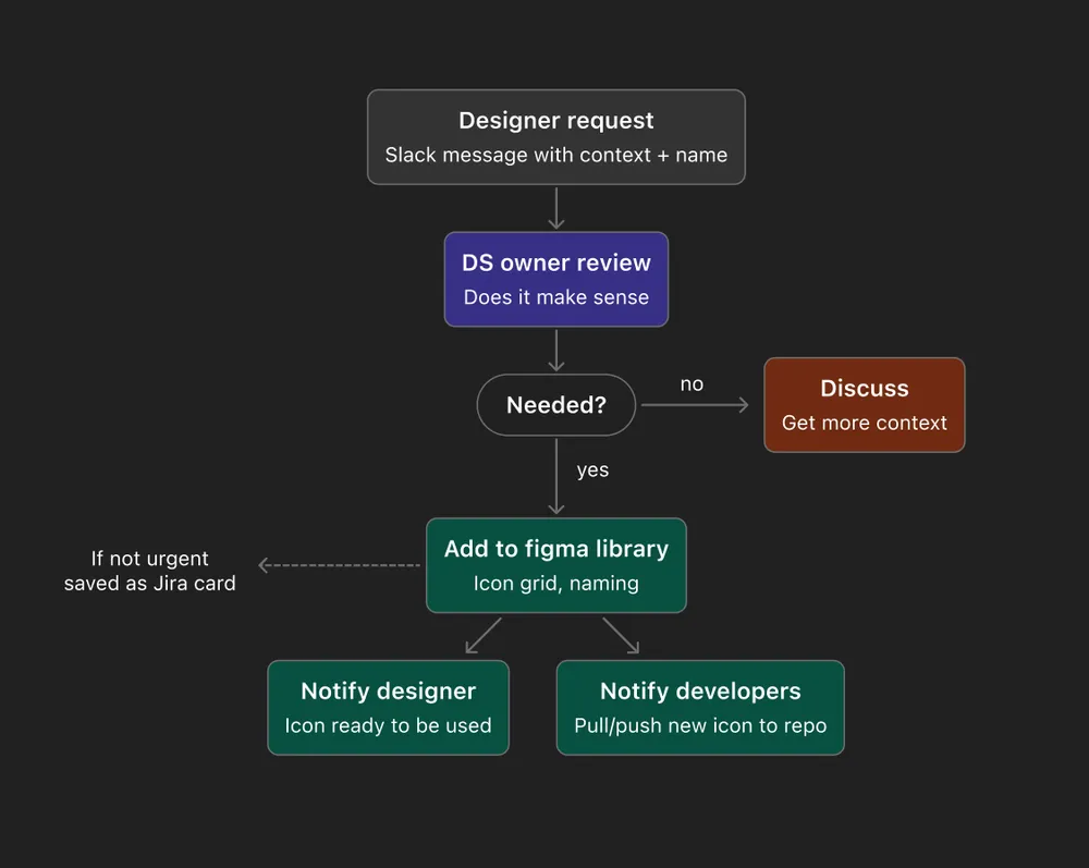
This worked well in a team of five designers. Either me or Cristian would handle it directly when time allowed, otherwise it went into Jira as a reminder. Simple.
I think the right flow depends a lot on the team and the person managing the system. The important thing is not to overcomplicate it. And over time, new icon requests should naturally decrease as the library grows and most use cases get covered. As long as there’s a clear owner and a way to reach them, the process should stay lightweight.