Project: Doggy App
Doggy App
Year:
2021
Role:
Product designer
Tools:
Figma, FigJam
Figma link:
Link to the prototype (opens in new tab)Doggy app design
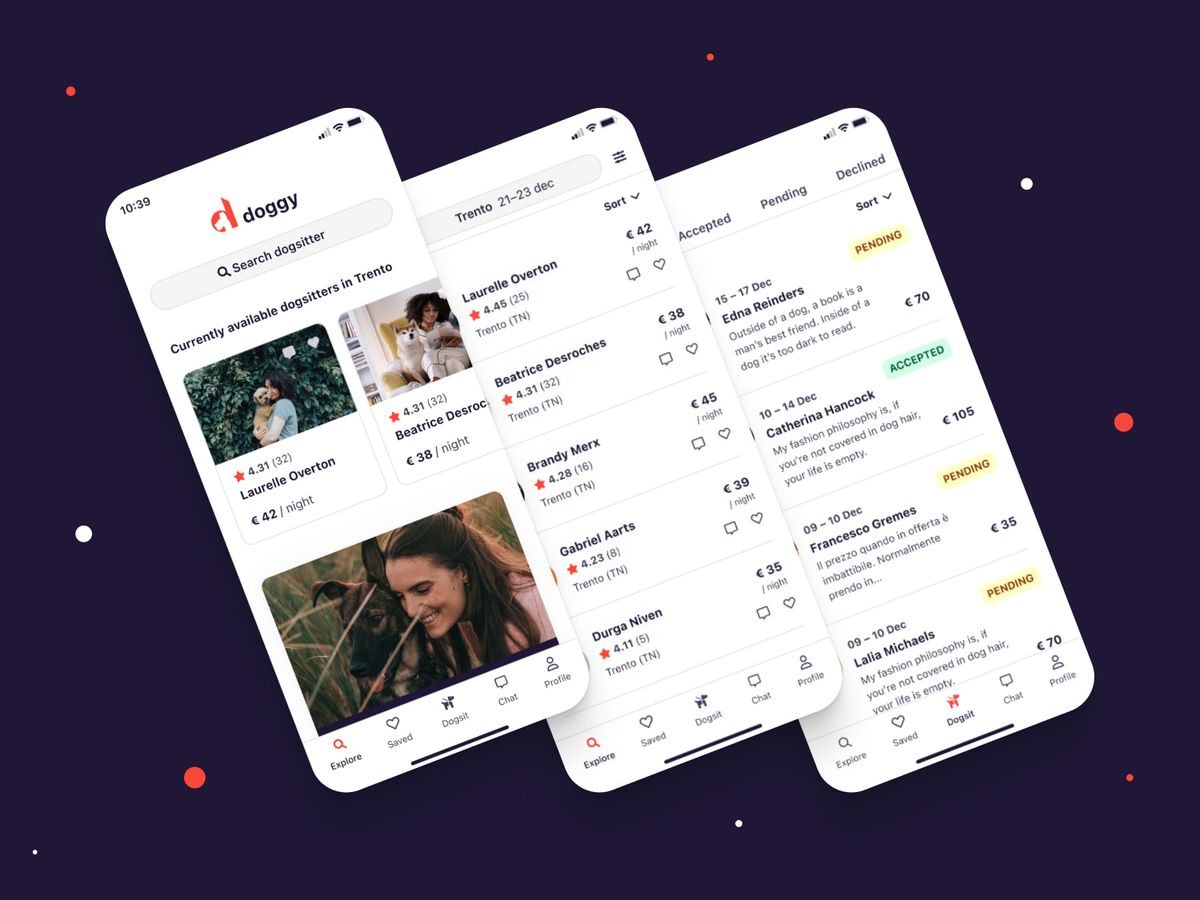
The doggy app was a project I designed in a two days sprint, so only a part of the entire app was done. I updated a little bit the components afterward, but the whole app design draft would take me at least three more weeks, it would be really nice to test it with real dog owners.
The primary purpose of this app is to help dog owners to find a dog sitter and for dog sitters to register and find potential clients to who they can sell their services.
To work on this app, I got a brief that I had to analyze and for what I needed to find a proper solution. You can find the brief in the link down below.

Requirements study
For this app, I got a google doc with the requirements to accomplish in the two-day sprint. These consisted in evolving two sections of the doggy app. The one for the dog owner and the one for the dog sitters.
Once I got to know the basics, I tried to apply what I learned to what I had in mind, I sketched on paper the structure of the world and then move it on Illustrator to show the sketches to my thesis curator. In the meanwhile, I started to play around with A-frame to see how complicated it was and if the project was actually feasible.
Link to requirements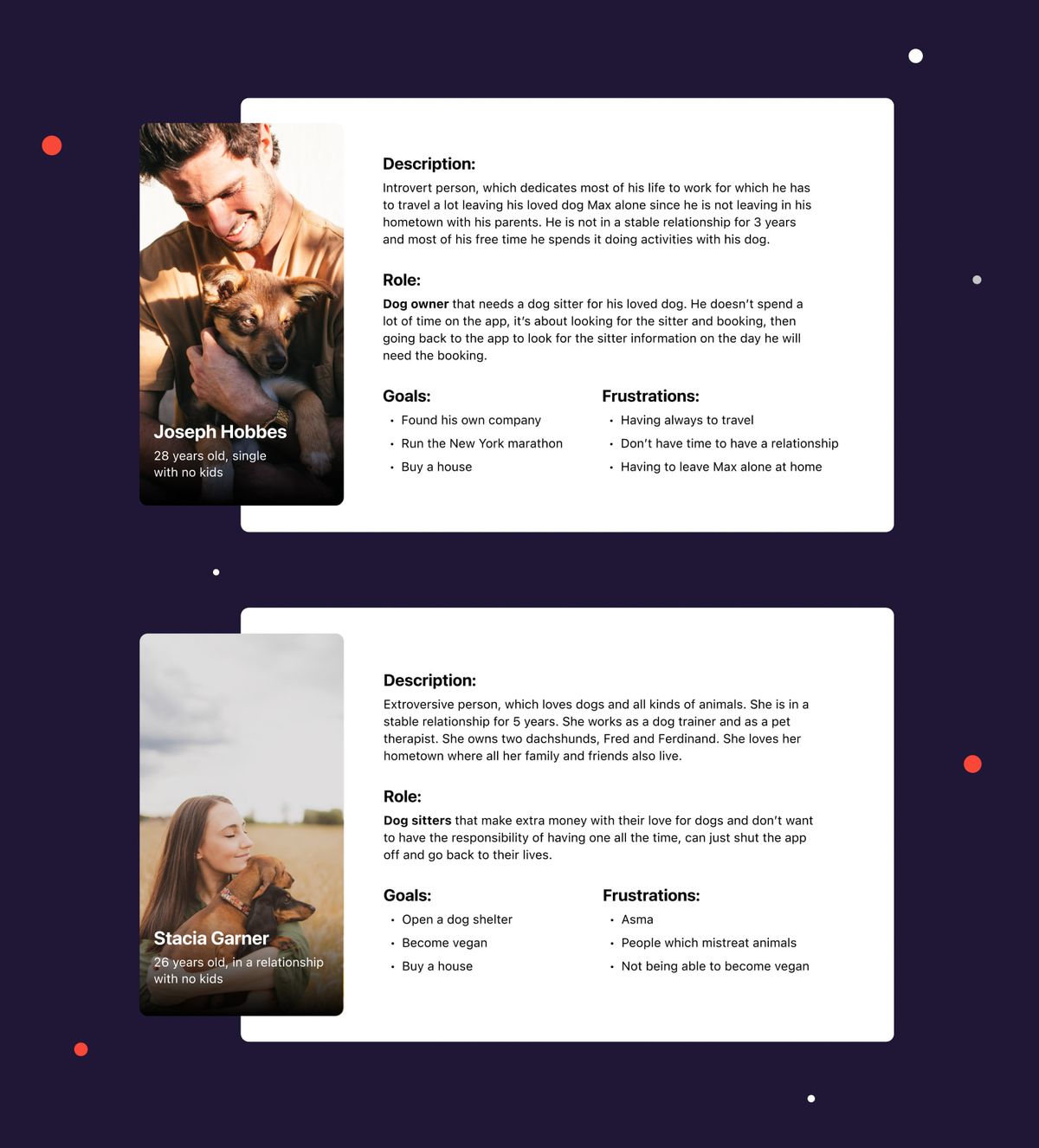
Site map design
Once I read the requirements multiple times, I started sketching on paper and defining all the sections and components I would have needed to design the app. Once I reached a point where things made sense, I created a draft of the app map, taking into consideration the sections I needed to evolve. You can see the result in the FigJam file down below.
Link to sitemapSketching
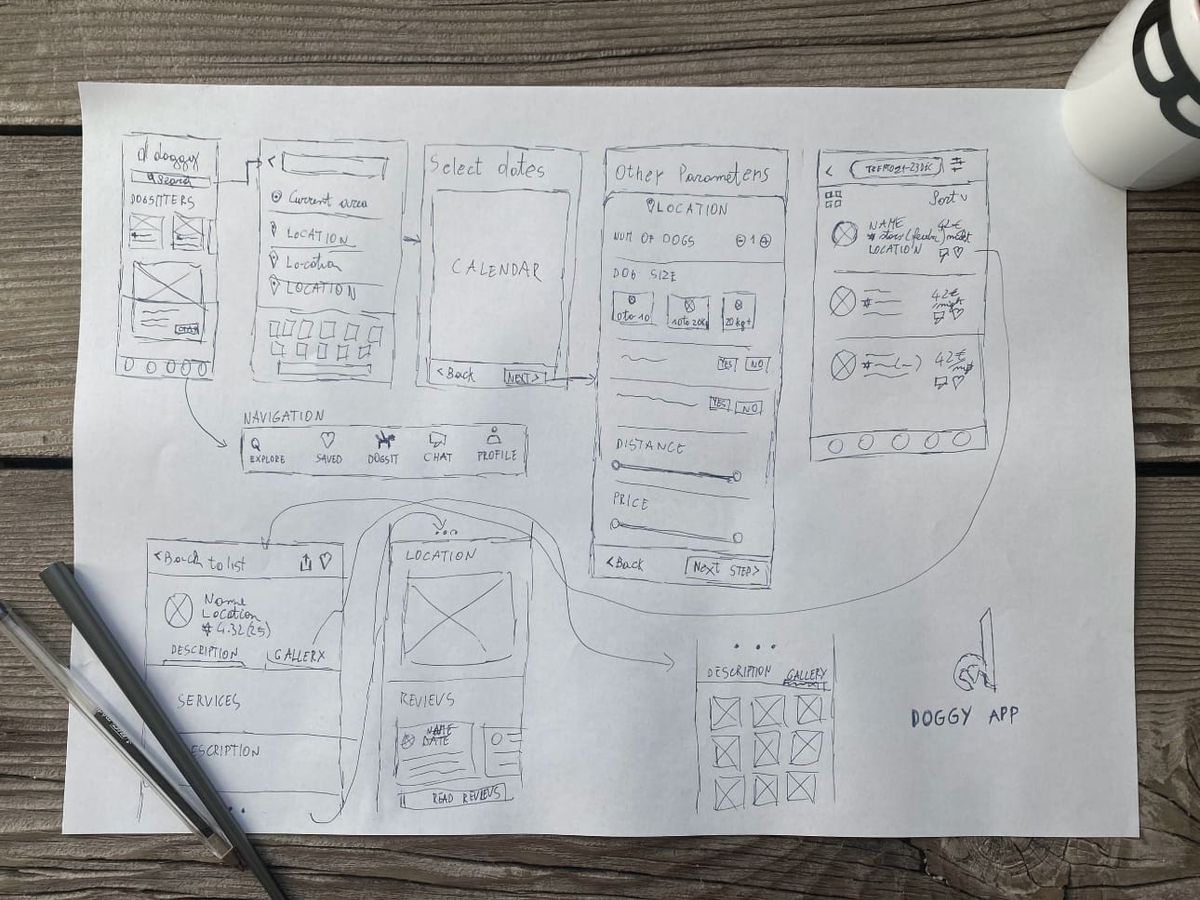
With the user personas defined and the action that they have to take somehow cleared, I started to sketch on paper to see all the components and the steps needed from the user. To create this I looked at already existing apps to see how they handled the flow and double-checked if what I was making made sense, and there weren't any illogical steps.
Usually, after I sketch on paper, I move everything on Figma and create a wireframe prototype that I would test with real users to see if what was made actually made sense. But since this was a sprint and I hadn't any real user I was able to test it only when I finished the whole design with my mother and brother, which are not actual users.
Styles definition
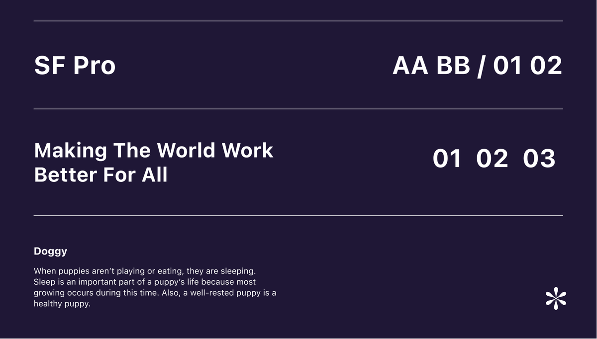
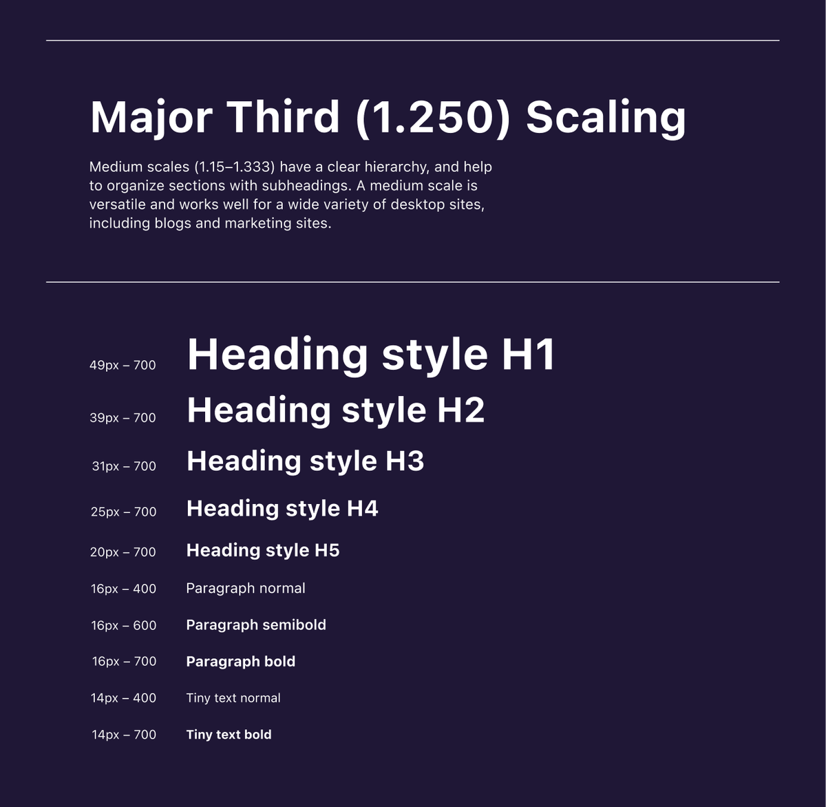
Once I knew how to structure the app, I started working on a brand and the basic styling to dress the UI and create the components. I made a Figma page with the different styles. Two with the color palettes for both the light and dark theme of the app. One for the font family I have chosen and one for the type scaling I decided to use for the app.
For the color I have chosen, I tested the accessibility of all of them, both the dark and light theme so to achieve all AAA results on the WCAG. Once everything was set, I saved the fonts and the colors in the Figma styles so that I could easily reuse them later and swap them everywhere needed by just editing the style in the list.
Link to styles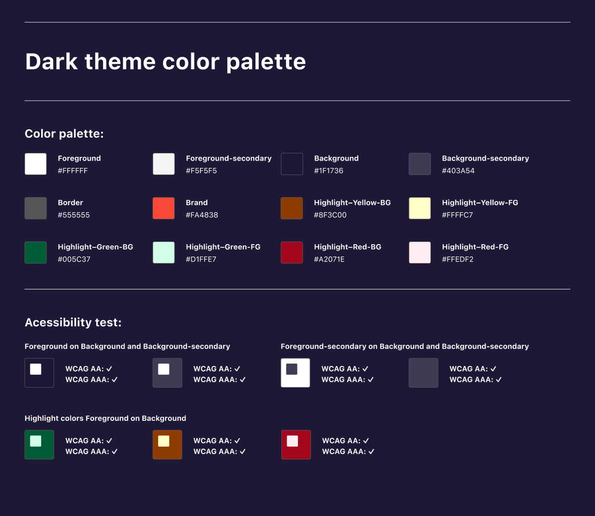
Components creation
Since the styles were defined and on the paper sketching, I saw more or less the components I would have needed. I started to create the components on a Figma page. For the time being, I made three buttons types with all their states and variants (primary, secondary, and text buttons). I also created a navigation component and a tab component.
For the icons, I used font-awesome, which has doesn't always work in the icon pixel grid, so I had to download all the SVG and make them fit in a 14/16/18px grid. Many other components like the tags and icon buttons should be implemented, but they took time which I hadn't during the sprint.
Link to components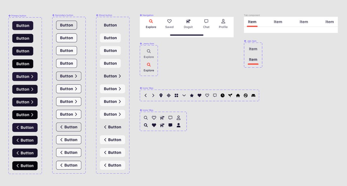
App design
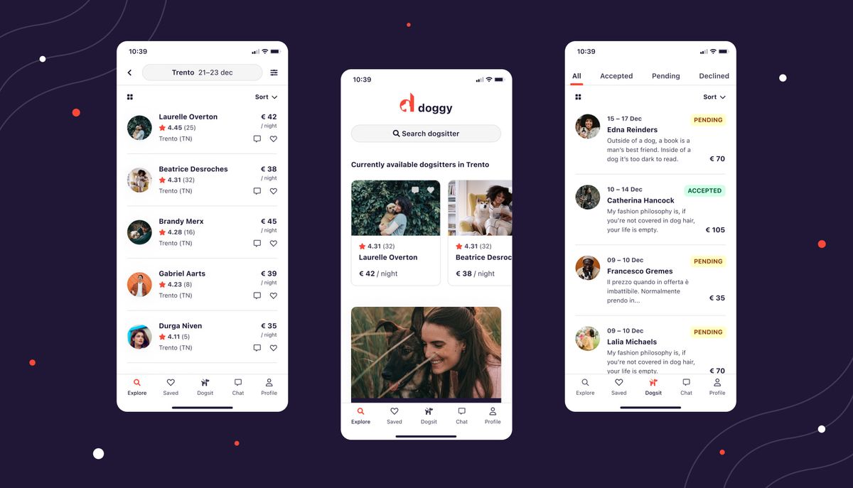
When all components and styles were finalized, I started to replicate the Ui, which I sketched on paper, on Figma. During the process, I had to edit some components, but overall, it was pretty rapid, plus while two palettes were defined in the styles with equivalent names, I was able to switch rapidly from one to the other by using the Themer Figma plugin.
Once I wired my prototype, the app was "ready" to be tested to see the final result, which you can find in the link down below. I didn't have the time to test it with real users, but I was pretty happy with the result I achieved in two days.
Final prototype